Website indexing for mobile devices: what is it and how to implement it
After smartphones and tablets appeared in the life of a modern person, more and more users began to use them not only for making calls, sending messages, but also for surfing the Internet. Now we actively use gadgets to search for this or that information on the network, to work with social networks, watch movies, programs, shows. One of the first to appreciate the trend of mass use of mobile devices when working on the Internet was the Google search engine. It was here that a lot of attention began to be paid to smartphones and tablets since April 2015. Today, Google actively works not only with desktop, but also with mobile versions of sites, indexing them. This means that every business that has its own online presence should take this trend into account.
In today's review, we will dwell in more detail on what mobile site indexing is in general. We will provide interesting statistics and a general chronicle of Google indexing, which will help you understand how seriously the search engine takes this area. We will highlight the main elements that must be taken into account when indexing sites intended for mobile devices. We will provide a number of practical recommendations that will help you make adjustments to existing resources so that they can be indexed by the search engine without problems. The information provided will help you navigate this issue and perform the upcoming work as correctly and professionally as possible.
What is mobile indexing in general
By such a term as indexing for mobile devices, we mean the fact of predominantly using the mobile version of the site content during indexing and ranking of the site.
Today, Google uses 11 of the most common types of search bots in its practice when scanning a particular site. The greatest demand is for scanners for mobile and desktop versions of the site. But at the same time, as practice shows, more attention is paid directly to those options that are designed to work through smartphones and tablets.
You can understand how seriously this situation has changed using a simple example. It is based on data from Google Search Console. So, 20 sites were checked by scanning them by Googlebot types in the fall of 2022, 2023 and 2024. And of all those sites that took part in the check, it turned out that crawlers worked with mobile versions more often, namely in 15 cases in 2022, in 19 cases in 2023 and in 20 cases in 2024. It turns out that the desktop scanning rate was 5 in 2022, 1 in 2023, and in 2024 there were no such cases at all. This allows us to confidently state that at present the Google search engine is betting on checking mobile versions of resources, and not on classic analogs designed for work with personal computers and laptops.
This once again confirms the fact that search engines are systematically reorienting themselves to current modern trends, including betting on solutions that will be as convenient as possible for users, and will ensure their most simple and flexible work.
Mobile indexing statistics
The Irish service StatCounter, which is a tool for analyzing web traffic, recently conducted a study, as a result of which it published statistical information on the market share of devices. So, at the end of last year the situation was as follows:
- more than 60% of users use their mobile devices when connecting to the Internet;
- laptops and personal computers are used by 37% of users;
- connection to the Internet via tablets is observed in less than 3% of all cases.
This information is further confirmation that today it is mobile devices that account for the maximum traffic. This means that modern businesses must take these trends into account in practice.
History of Google indexing by mobile devices
We have already mentioned that the first to appreciate the prospects and mass use of mobile devices for surfing the Internet was the Google search engine. The initial changes here occurred in April 2015 and were completed by July 2024. But between these dates, quite active and interesting changes took place. Here are just the main ones, allowing you to see how actively the search engine has been developing in this direction:
- The launch of the Mobilegeddon update from Google in April 2015, which involves assessing the convenience of users when working with the Internet through mobile devices as one of the key ranking factors.
- Announcement and trial testing of Mobile-first indexing on several sites in November 2016.
- Full deployment of mobile indexing in March 2018.
- During the scanning of sites, more than half began to fall under Mobile-first indexing already in December 2018.
- All new sites appearing on the network began to be indexed by default directly in the version for mobile devices since July 2019.
- During the scanning, 70% of all sites fall under Mobile-first indexing already in March 2020. In addition, the company announced at that time that by September 2020 such indexing would be applied to absolutely all Internet resources. But, alas, coronavirus restrictions postponed the implementation of this idea.
- Only in March 2021 was it possible to launch 100% Mobile-first indexing in preliminary mode.
- For technical reasons, in February 2023, there are still some sites that require indexing exclusively for desktop computers, although most sites are switching to indexing with priority for mobile gadgets.
- The last sites will switch to Mobile-first indexing in May 2023. Those resources that remain on desktop scanning — these are exclusively sites that do not work on mobile devices at all.
- Since July 2024, all sites that do not provide access from mobile gadgets are not allowed to be indexed by the search engine at all.
Such a chronology allows you to see how consistent the actions of the search engine were in the process of switching from desktop to Mobile-first indexing. Each owner of online sites can independently check whether their site has switched to indexing with priority on mobile devices through the Google Search Console service. To do this, you will need to go to the "Settings" menu, and then select the "About Us" option. Here you will find the relevant information about whether your site uses the Mobile-first indexing solution and at what point in time this transition was made.
The Main Ways to Ensure Site Indexing for Mobile Devices
Now that you have fully realized the need to switch to mobile indexing, it is time to talk about how this solution looks in practice. That is, you need to determine a number of factors and elements that will help you configure your site so that it passes Mobile-first indexing without problems. So, in this case, you need to do something that will allow you to adapt your site to work with mobile devices. In this case, we are talking about solutions such as:
- Creating an adaptive design.
- Using dynamic service.
- Using separate URLs.
Each of these methods has its own advantages and disadvantages, which must be taken into account. This way you will be able to choose the solutions that will be most effective in your work. We would like to draw your attention to the fact that it is optimal to perform these works already at the stage of developing the site itself, which will minimize the need for subsequent improvements and transformations. By the way, it is also recommended to implement SEO at the stage of creating the site in order to minimize subsequent adjustments. Let's consider the cards from these options in more detail.
What is adaptive design
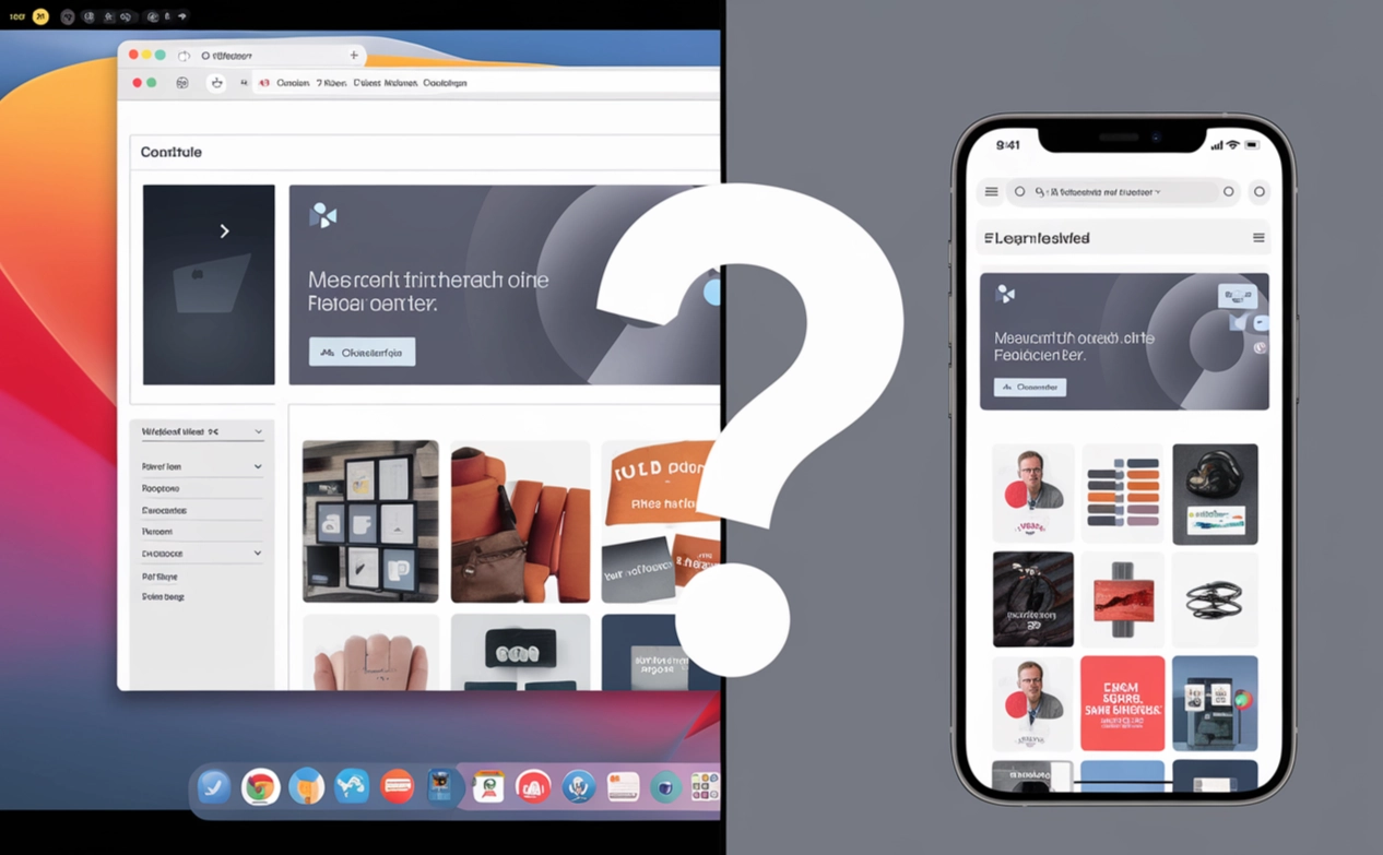
By adaptive design we mean an external solution that uses the same HTML code for all devices, as well as adjusting the layout using CSS, that is, automatically depending on which screen the site is currently displayed on. This is what will make the site as convenient as possible for users, regardless of which devices they connect to it from. That is, in this case, we will have the same URL for both the mobile and desktop versions. When adapting the layout to certain screen sizes, special media queries are used.
If we talk about the advantages of this method, it is worth highlighting:
- easy to maintain the site, because after all we only have one version of the site;
- no risk of duplicating content, as well as the occurrence of a number of related problems;
- providing each user with the same opportunities for work, regardless of the devices through which they connect to the site;
- the ability to use simplified SEO, since all backlinks will still lead to the same site;
- minimization of time and material costs for working with the site, since all actions will be performed once;
If we talk about the disadvantages of developing adaptive design, it is first of all worth highlighting certain difficulties at the implementation stage. This will be especially relevant for multi-page sites with a large number of attachments. In addition, the implementation of these works will require the involvement of specialists who are well versed in media queries and CSS in general.
Using dynamic maintenance
Dynamic maintenance is a technique that involves such maintenance by the server, in which it will send only those HTML and CSS files that will be adapted to a specific device. In this case, the URL of the site remains unchanged, but the content will still change depending on whether at the moment we are talking about a smartphone or a personal computer user. It turns out that the server will automatically determine what type of device is sending the request and ultimately send the appropriate version of the site.
Dynamic service has several advantages:
- users receive the version of the site that is the simplest and most convenient for them to use at the moment;
- the risk of content duplication is eliminated, since in this case the same URL address of the site is saved;
- all tasks for selecting the appropriate version of the site are performed by the server automatically, which eliminates the need for manual work.
Are there any disadvantages to this method? Let's just say that there are points that need to be taken into account. In particular, it is impossible to exclude the possibility that the user agent will be determined incorrectly. This means that an incorrect version of the site may be sent to it. In addition, the implementation and support process itself will require more time and effort compared to developing the same adaptive design.
Using separate URLs for the mobile and desktop versions of the site
The two methods that we described above involve using the same site addresses in both the desktop and mobile versions of the site. But in this case, you will also have the opportunity to avoid such a solution by providing a separate URL for the desktop and mobile versions of the site. In most cases, the mobile version will be located on one of the subdomains. In this case, we get that the address that is characteristic of the mobile version of the site will be served from its own subdomain or subdirectory.
The main advantages of this solution include:
- the ability to create such mobile versions of sites that will have the highest customization rates;
- suitable for resources with a complex structure;
- can be used on old sites that prove problematic during adaptation to the mobile version.
But, relying on such a solution, you should understand that you will have to put much more effort into solving everyday tasks. By and large, you will have to do the same work twice. There is also a risk of duplicating content. In particular, this occurs in practice if certain errors are made during the implementation of canonical tags.
If you weigh the advantages and disadvantages of each of these options, you can come to the conclusion that the most effective way to ensure good Mobile-first indexing will still be the development of an adaptive design. Now let's talk directly about how to implement such site transformations.
Implementing Mobile-first indexing
If you want your site to pass mobile indexing without problems, it must be initially prepared for this work. In particular, it is recommended to implement the main activities at the stage of creating the site itself. This is what will minimize problems and the need for improvements in the future. That is, before launching the site on Mobile-first indexing, you need to do the following:
- Make sure that the site is available for scanning. This means that it must be visible to Googlebot Mobile. The pages that you would like to index must not have the noindex tag, indicating that you are asking search bots not to index this page. If you have been using outdated technologies up to this point, such as Flash, then it is time to replace them with more advanced ones, in particular JavaScript, CSS. Such a site update will guarantee the availability of critical files for you for the bot that will scan the pages. Also, all files in robots.txt should not be blocked by the disallow rule, which tells Googlebot exactly how they should “read” your site. That is, it is important for you to check all these points and make sure that search bots will see your resource exactly as you want to present it, including to users.
- Implement structured data markup on the pages of your site. There are many options here, but you will only need to use those that are relevant specifically to your site. The fact is that structured data can significantly simplify the indexing process, improve the visibility of your content and significantly increase the likelihood that it will be displayed in search results in the format of extended fragments. This information format itself allows search bots to better understand the contents of the page, and this is the key aspect in ensuring a fast and accurate search. That is, by implementing these simple measures, you can significantly increase the conversion rates to your site, since your content will be displayed in the search results in the most presentable way.
- Make adjustments to your media files, improving their quality through optimization. Practice shows that many images that are uploaded to the site are quite large. They significantly increase the size of the page, slowing down its loading. In this case, the first thing you need to do is change the format of your images to a more modern solution - WebP. Unlike the classic JPEG or PNG options, such media files will weigh on average 25-35% less, while maintaining the original high quality. For images, it is imperative to use alt attributes, since it is by them that the search engine is able to recognize your image and process it accordingly.
- Implement the viewport meta tag on the site. It plays a very important role in mobile indexing, telling browsers how to correctly manage the scaling of the page and its dimensions in general in accordance with the screen size on which they will be displayed. You will need to embed the viewport meta tag directly in the «head» of your overall HTML. Once this is implemented, the browser will understand that you are asking it to adapt to the screen width in pixels, regardless of the type of device. It also sets the initial zoom level, namely 1. Thanks to this configuration, the user's interaction with your content is significantly improved, regardless of the device he uses to access it. In any case, the page will be readable. And all this will be done in real time, eliminating the need for additional scaling, horizontal scrolling.
- Set priorities aimed at optimizing performance. In this case, we are talking about the fact that, when performing a general transformation in the course of increasing the page loading speed, it is important to bet directly on the mobile version of the site. The fact is that these are the indicators that will subsequently be used during ranking. Users who use mobile devices when connecting to the Internet also expect the fastest possible loading. In the event that your site takes too long to load, people will simply leave it, which will be the main reason for the increase in bounce rates. We are in no way calling for neglecting the desktop version of the site. Your task here is to create a resource that will work perfectly on both desktop and mobile devices. By relying on only one of the options, you will not be able to implement your business ideas and ensure stable website promotion and development of the company as a whole.
If you can implement these works as correctly as possible, you will end up with a website that is highly likely to pass Mobile-first indexing and will not require any serious modifications from you.
Additional recommendations
We have already talked about the fact that you can independently check whether your website has switched to mobile indexing. But if the answer is negative, then something went wrong and you need to find the reason, eliminate it as quickly as possible. Otherwise, your site will not be indexed by search engines at all. Here are a few simple recommendations that will help you understand all the nuances and be prepared for unforeseen situations:
- Make it a habit to save extremely important material. It is clear that the site will be displayed wider on a computer screen. Any small details that you provide in the settings will be present here. It is not possible to fit all this on a small smartphone screen. Often there is no room for sidebars, mega menus. If all this is not hidden, it will overlap content fragments, which will negatively affect the usability. And here the only way to solve the problems is to prioritize and focus the audience's attention on the most important points. So, if you remove the button with the feedback form, people will not be able to contact you for advice. Modern technologies offer a wide variety of design options, including its form of content tabs. This option is worth paying attention to, since Google has recently begun to pay special attention to improving the user experience. It is not necessary for the mobile version of the site to be identical to the desktop one. You can create simplified pages by adding elements that will be revealed upon user request, such as additional information about products, reviews, the most common questions and answers.
- Optimize the number of pop-ups, ads, interstitial ads. This is all that will take up space on the smartphone screen, overlapping the main material, reducing the user experience. We have already said above that you need to prioritize and allow only important elements to be displayed, while others will be hidden until the user clicks on the appropriate button to examine the details in more detail.
- Correctly think over navigation and internal links. Building up external link mass is important for increasing the site's position in search results and its visibility in general. But it is also extremely necessary to correctly work out internal links, making sure that all of them are also presented in the mobile version of the site. In practice, there have often been cases where breadcrumbs were simply removed from such sites in order to save space. Internal linking is what will allow users to navigate your site faster and better, find useful products for themselves. Therefore, do not be lazy to go through the mobile version and make sure that all these links are present, that they are active and lead to the correct pages.
- Make sure that the loading speed remains high. The fact is that the Google search engine will still focus on the mobile version when determining Core Web Vitals. These works can be implemented through the Google Search Console service. In this case, you will need to go to the "Improvements" tab, then click on the "Core Web Vitals" option and here select the "Mobile" option.
- From time to time, conduct technical checks. This is what will allow you to constantly be confident in the stable operation of your resource. Alternatively, you can create an Ahrefs Webmaster Tools account completely free of charge and then scan your site in Site Audit using a personal user-agent. Thanks to this, you will see how the resource is displayed on a personal computer. But if you go to the "Scan Settings" tab, and then to "Project Settings", you can change the user-agent from Desktop to Mobile. Now you will see how the site is displayed directly on mobile devices. We would recommend running both scanning options: on the desktop and on the mobile device. This will launch the comparison function, which will automatically notify you of detected changes or the appearance of any problems in a particular version of the site. That is, you will have a clear picture of the appearance of the site. But we also recommend paying attention to filling in the headings, meta descriptions, robots meta tags, canonical tags, hreflang tags, alt attributes for images, and structured data.
- We check the correctness of the robots.txt files. In particular, we are talking about checking the fact that this file contains other rules for m-dot site subdomains. In particular, you will need to compare yourwebsite.com/robots.txt and m.yourwebsite.com/robots.txt, i.e. the options for the desktop and mobile versions of the site, and identify existing differences. In addition, it is also important to make sure that all CSS and JavaScript images are open for scanning on both versions of the resource.
- Think through the design of the mobile version of your site in detail. To implement this idea, it is worth analyzing competitors' sites and identifying a number of those mobile design practices that give maximum results in practice, i.e. attract the audience. Here, you should pay attention to text sizes, indents, and click targets. You can also use a special Google test designed to assess the usability of the mobile version of sites. Similar solutions can also be found on the Google Search Console service. Here you need to go to the "Improvements" tab, and then select the "Mobile Usability" option.
Implement this event to get a really high-quality mobile version of the site, which is guaranteed to be indexed in search engines and will be as convenient as possible for users in the future.
Let's summarize
Today, almost 70% of the world's total web traffic comes directly from mobile devices. This is what has largely become the reason for serious transformations in the work of search engines, but Google rightfully occupies the leading position here. Today, it simply stopped indexing all sites that do not have a mobile representation. So, to create a similar version of your site, you can use adaptive design, dynamic feed, or use separate URLs for the desktop and mobile versions. Practice has repeatedly shown that the best option here is still the use of adaptive design. But you shouldn't rely on it completely. In your work, you will also have to put in a lot of effort to get a platform that will be displayed really well on mobile devices.
In the review, we looked at all the solutions that need to be implemented to get a really decent result. mobile proxies from the MobileProxy.Space service will help to significantly simplify the upcoming work, speed it up, improve the quality and minimize physical effort. With their help, you will be able to easily use various tools and services to automate routine and similar work, including data collection, control over technical parameters, etc. Also, with their help, you can ensure yourself guaranteed anonymity of work on the Internet, protection from any unauthorized access, including hacker attacks, bypassing regional blocking and access restrictions.
We suggest you follow the link https://mobileproxy.space/en/user.html?buyproxy to evaluate the features and advantages of these mobile proxies, their functionality, and to understand how advanced and technologically advanced the product is at your disposal. It is convenient that you will have the opportunity to test this product for 2 hours and see how advanced and technologically advanced it really is. If any difficulties arise in subsequent work, you can contact the technical support service, which operates around the clock, for additional advice and assistance.